Monday, February 17, 2014

Types of Way Finding Signage

What is Wayfinding? 

-Creates a public narrative of how people witness, read, and experience space.


Types of signage: identification-sets a tone/mood, preparing the user with something that's gives them sense of Atitude 

directional-addresses the paths, cued to keep moving once they have Started..bread crums. Needs to be obvious and recognizable 

and orientation- organizes and simplifies a complicated space, what you're going to expect, offers visitors an overview of their surroundings (maps, diagrams, directories). Needs to coordinate with other identification and directions. 

Handicap- five primary elements to the environment
1. Are there patterns- paths
2 edges-boundaries between to places, Transistion points
3. Districts
4. Nodes-centers of attraction, where decisions have to be made
5. Landmarks- large scale, elements that become icons

A activity, what is the destitination and how will they get there
E environment 
I individual (who will be using the space)
O object (elements that can be intervined with)

U understanding (how can help users)


http://jayce-o.blogspot.com/2012/12/awesome-signage-wayfinding-environmental-designs.html


Thursday, January 23, 2014

Wescoe

Where the heck is the Underground?  

Main Intention-Navigating through Wescoe and getting from the main entrance to the Underground. 

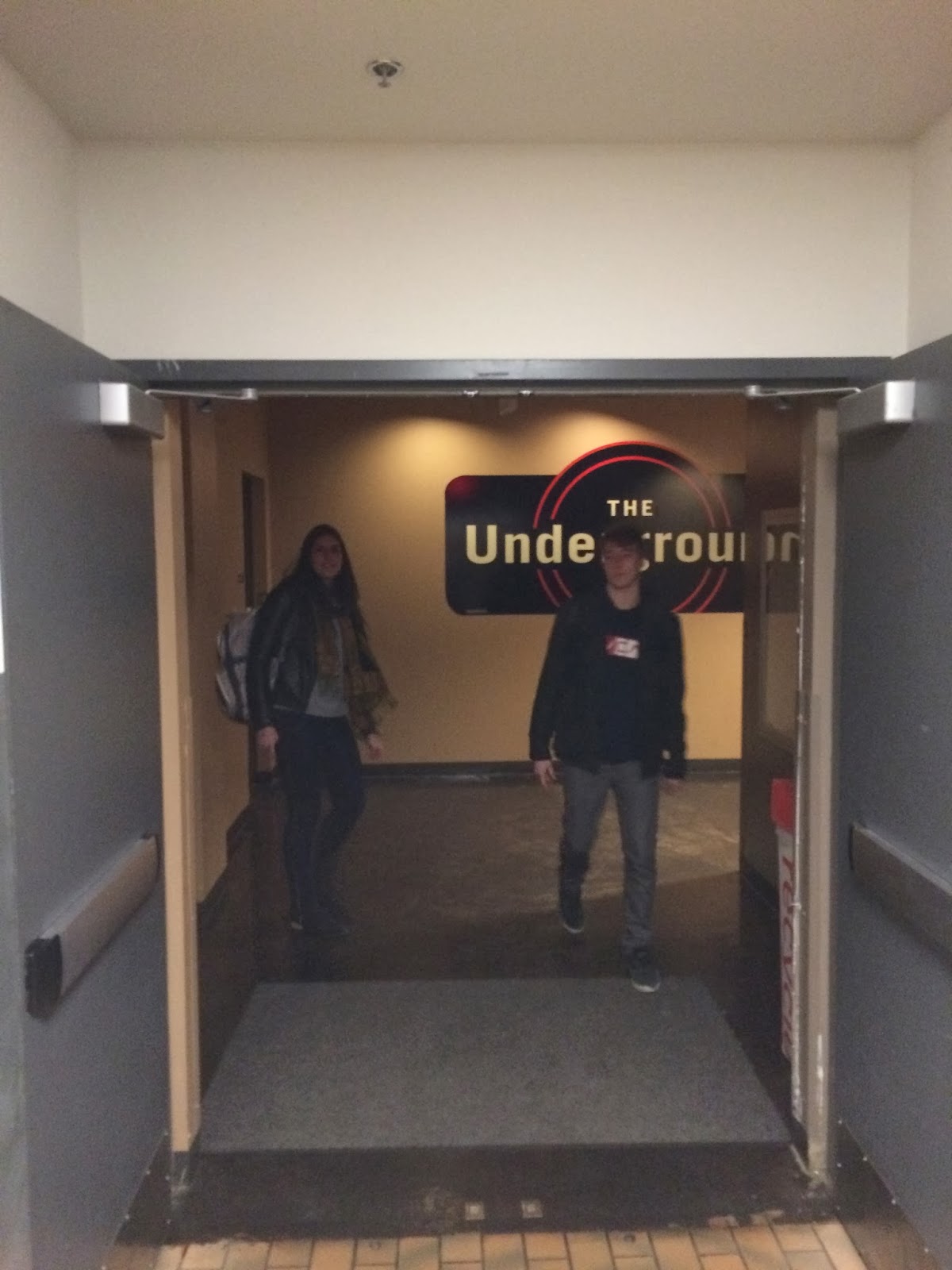
We found that there are many complaints when it comes to Wescoe and where certain things are. When our group had walked up to Wescoe, our first concern was where should we walk in? Where is the main entrance? Once we entered the door that we assumed was the main entrance, we started to walk through the building. We didn't know which rooms were classrooms and which rooms were offices. It also took effort to look for the stairs and once we got to them, there was no sign to where they really lead (other then a 4 in. x 4 in square). We had gotten to the first floor and started walking around. We walked around a random corner and all of the sudden, there was the Underground, where people gather and eat. We realized there was no indication on how to get to the Underground. After wandering around Wescoe, we decided we want the process of finding places in Wescoe to be easier and quicker. We have started brainstorming things like large colored arrows, interesting signs guiding to you where you want to go, etc. 

Here are some pictures of our journey. 


Thursday, December 19, 2013

Chicago: My Roots


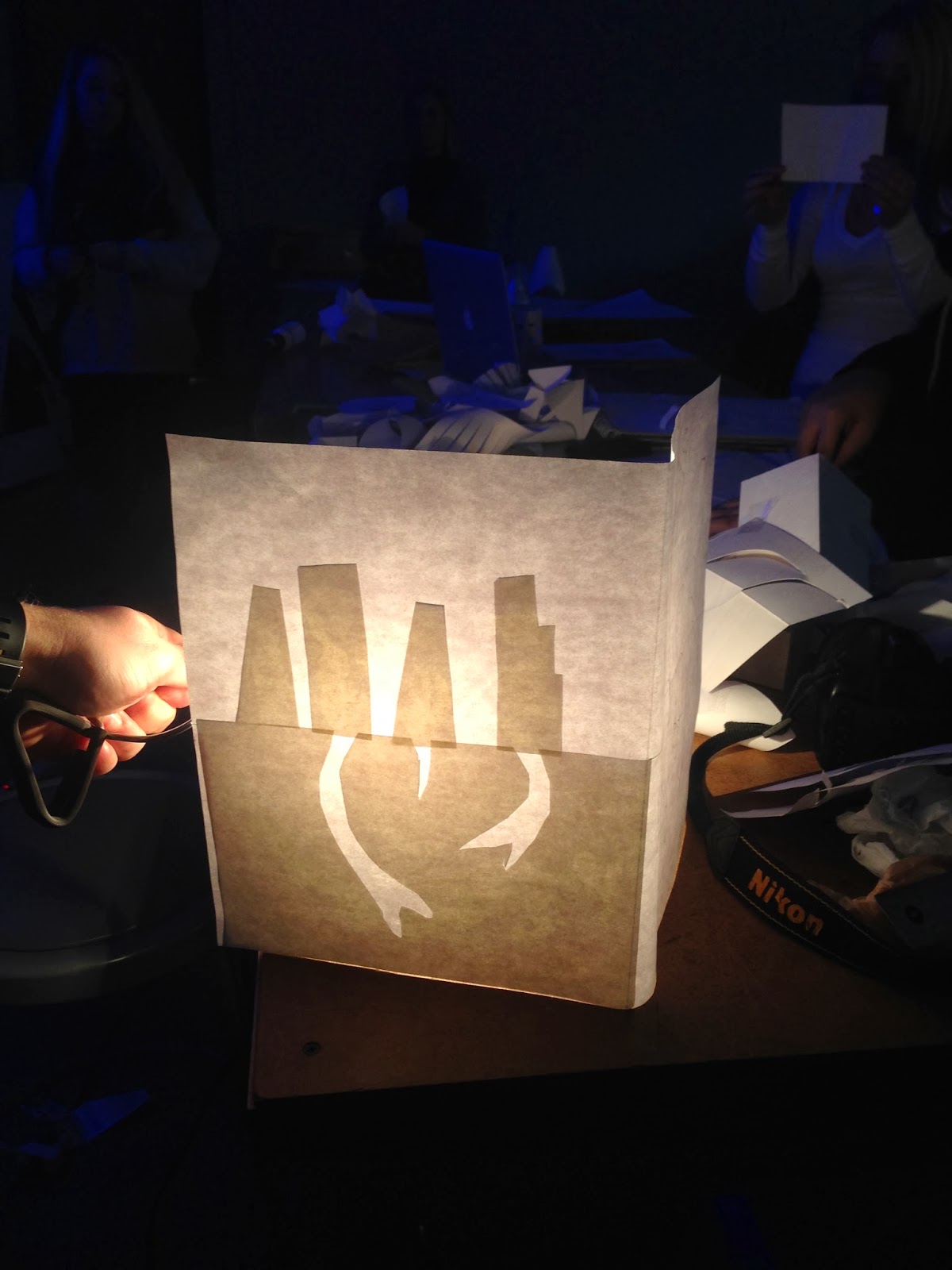
Here is my final light. I think I liked the idea more than how it turned out. I definitely plan on playing around with this idea in the future. Although it isn;t exactly the way I wanted it to be, I still love how it looks. I thought of having a top and bottom, but I actually like how light is coming from the top in comparison to Chicago being my light (start of future). I would have the paper of the roots as wide as the skyline but it didn't work out that way with the supplies I had. If I did have a top, I would've cut out four stars representing Chicago's flag. I also would have skyline a bit wider so it's going into the wall. Overall, it was fun project playing with light and paper. I would love to a project like this in the future.

Process of Light

Here are some of mine and other classmate's paper experimentation. This was a fin exercise as I didn't know how much you could do with paper. It was interesting seeing other classmates and it inspired me to come up with some ideas.  
Add caption

Here is the very start of my project. At first I thought of having a tree with roots coming out of the bottom due to the required use of only paper. Then I thought that was kind cliche and one before. I started thinking of roots and trying to connect to me, personally. I annalyzed the true meaning of what are roots and what are my roots. I instantly thought of Chicago and then this idea played out. I was paired with Michael and if it wasn't for him, I would've created my project a bit differently and it might have been worse. He told me to put the skyline and the roots behind a piece of paper and we came up with this example. I liked how he cut out the skyline and for the roots he cut into them. It gave good contrast and I decided I definitely wanted to approach my project this way. 

Here is my more developed draft. The critique we had was very useful. I liked the box idea but someone suggested that it it come out of the wall and back into it. Also it was suggested that I leave more white space. I learned that roots should be cut differently not going into each other. I also wanted to create a layering affect with the buildings. 


Some examples of inspiration that I liked. 

The light I used.


Laying everything out after it has been cut. 


Almost complete!


Monday, November 11, 2013

Parts of the Letter

Typography

  • evolved from handwriting 
    • which is created by making series of marks by hand
    • the fundamental element constructing a letterform is the linear stroke (stem)
    • each letter of our alphabet developed as a simple mark whose visual characteristics clearly separated from all others
  • by learning the vocabulary, designers and typographers can develop a greater understanding and sensitivity to the visual harmony and complexity of the alphabet
  • typography employs a number of technical terms
  • knowing the letterform component parts will make it much easier to identify specific typeface in the future 

Terms

  • serif: the short strokes that finish off the major strokes of the letterform 
  • bracket: a curving joint between the serif and the stroke
  • baseline: the imaginary line defining the visual base of the letterform. all letterforms sit on the base line. 
  • cap height: the height of the upper case in a font, taken from the baseline to the top of the character. 
  • x-height: the height lowercase x. if you compare typefaces of the same point size they may not have the same x-height. refers to the distance between the baseline and the mean line in a typeface.
  • ascender: a stroke on a lowercase letter that rises above the x-height 
  • descender: a stroke on a lowercase letterform that falls below the baseline
  • bowl: the rounded form that describes a counter, the bowl may be either open or closed
  • counter: the negative space within a letterform either fully or partially enclosed
  • link: the stroke that connects the bowl and the loop of a lowercase letter like a g
  • loop: the bowl at the lower part of the lowercase letter such as g, it can be open or continuos 
** A good example of how counterform can be used in design and especially logos is the Fedex logo

Reflection 

This reading was evidentially about the parts of the letter. It went into detail of each part and what makes up different letters. I find typography very interesting and always have. It's amazing how different letters can be, but all come together to make up a word or saying. I find knowing about typography and it's different attributes very useful when it comes to design. Design is all around and within a lot if not most of that design involves typography. It makes up our language, how we label things and how we understand them. When it comes to my field, it will be useful knowing the complicity of typography in order create successful logos, advertisements, etc. It's interesting how simple a letter can be but in reality there can be many different parts to the letter. This reading allowed me to increase my knowledge in identifying specific typeface and parts of letterforms. 

Tuesday, October 22, 2013

Sketches

Here are sketches of the three objects I brought in. A roll of toilet paper, a plastic water bottle, and an eraser on a number two pencil. 


Poorly Designed Objects

Make it Better

            Here are the three objects I chose for the topic of "poorly designed". I chose a plastic water bottle because it's terrible for the environment. It also can melt due to heat and it isn't very durable being able to squeeze it and have it deform or not be it's original shape. I chose an eraser placed on a standard #2 pencil because it takes only a couple of uses until it cracks off and you are left with hardly anything to erase with. Cheap and annoying. The other object I chose was a roll of toilet paper. Sometimes, not all the times, people can have trouble knowing how much toilet paper they truly need due to the quality of the paper. Instead of being able to pull as much toilet paper as you want off the roll, the roll should dispense the paper in sections so you don't waste paper or so you do have enough.

Water Bottle 
The eraser on a #2 pencil
A roll of toilet paper
A Wooden Spoon
Uno Card Dispenser
Kitchen Roller 

We were put in a group of four. My other team members consist of Henna, Brendon, and Laura. Here are some of the objects that the rest of the team members brought in. Henna brought in a wooden spoon and had a clear idea of why it was poorly designed and how to make it better. She mentioned that it was too shallow to scoop successfully and could not scrape properly. Brendon brought in the uno card dispenser and simply said it didn't do what it was supposed to do:dispense cards. Laura brought in the kitchen roller and noted the fact that your hands rub against the counter as you try to use it making virtually impossible. We all looked over the rest of the objects and decided to chose the wooden spoon henna brought in. It wasn't a terrible product necessarily but it had a lot of room for improvement. It seemed like we instantly started coming up with ideas analyzing the spoon and how we could make it better. Before we knew we were Team SPOONTULA and we had a goal of combining a spoon and spatula.