Color Theory Examples
Harmonious Hues
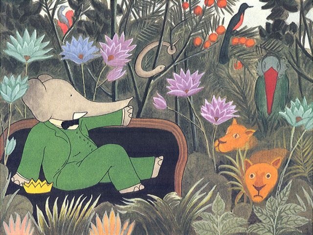 |
| Blue, purple, and green are next each other on the color wheel. The flowers have harmonious hues which make them stand out of the jungle-like environment. Laurent de Brunhoff is the illustrator of Babar the Elephant. |
 |
This is a painting I did two summers ago. I used red, yellow, and orange which fall next to each other on the color wheel. I gave it too much harmony and it might be hard to look at. Although, I used the same harmonious hues for the sky and the ground looking completely different, and it gave it a nice connection between the two.Contrasting Values |
 |
| I honestly have no idea who the artist is but I know his work. His paintings are usually very simple yet very unique. I took this picture at the Art Institute of Chicago and was very drawn to it's symbolism. The contrasting values here are blue and orange, which doesn't create the pop out effect but it does create a connection between the two young boys. |
 | ||||
This piece was displayed in the Spencer Museum of Art, and I unfortunately don't know who the artist is. The contrasting values are the powerful splashes of red and the soft, creamy, greenish yellow. I could have found a better example but I think this painting really stands out due to it's contrasting values.Harmonious Chroma 
These are two pictures of my mother and I in Miami. One is with the flash and the other is without. I thought this was a good example of harmonious chroma because of the pictures contrast in light. The top picture is colorful and bright representing strong chroma. The bottom picture is dull and dark representing weak chroma.
Harmonious Value
Contrasting Chroma
I took this picture at the Art Institute of Chicago. The painting is title The Banquet by Rene Magritte. The trees in this painting are dark green with brown. The sky is orange with hints of yellow. The sphere placed in the middle of the work is a solid red-orange that inevitably sticks out contrasting with the dark trees.

I also took this picture at the Art Institute of Chicago. This is a oil painting titled Mund (translated into mouth) by the artist Gerhard Richter. While taking an oil painting class at SAIC, I had to replicate this painting and achieves the contrasting chroma. The light and dark value of this painting really captures the contrast of the red and brown. The lips don't pop out but stand out due to it's color contrast. The lips blend well due with the circular brushstrokes repeated in the brown colored face.
Limited Palette
This is a Picasso titled Women in a Red Armchair. This is located at AIC. Picasso used a very limited palette with a consistent tone. He used the color scheme: brown, purple. green, yellow, black, and red.
 Soften Contrast/Weaken Chroma
Strong chroma is less prominent in this image I took of my friends dog The lighting gives it a hue that connects the contrast of the picture, having the picture display a soft tone. .

The strong chroma uses is slim far in the background of this photo. I grabbed this photo off tumblr and do not the photographer. The sky is subtle and fades into a delicate blend that exhibits a soft contrast.
Transitions in Hue/Value/Chroma
I took this picture at the Art Institute but do not the know the artist. The transition of value, hue, and chroma is very successful here. The background has a cloudy like essence with the blue capturing as a sky or ocean in the back. The dark gray and transition of the color's value gives the work a sense of dimension.

This is a simple water color painting of a diamond. I do not know the artist because I had grabbed it from tumblr a long time ago. Transitions of value within the same hue produce a three dimensional object. The chroma is weakened in areas giving it space and making it look realistic while still remaining very simple.
Use of Neutrals
This is a picture I took in Miami in the area Wynwood where every building is covered with murals, graffiti, street art, etc. I really liked this work and the use of neutrals is spread throughout the typography.

This is a work I grabbed from tumblr awhile ago, so the artist is unknown. The use of neutrals is practiced as your eyes go down the piece of work The pink, yellow, red, and orange color scheme is used within the sky and the sun. The mountains filled with faced uses green, blue, blending well together and contrasting the sky.
Dominance of Hue/Value/Chroma 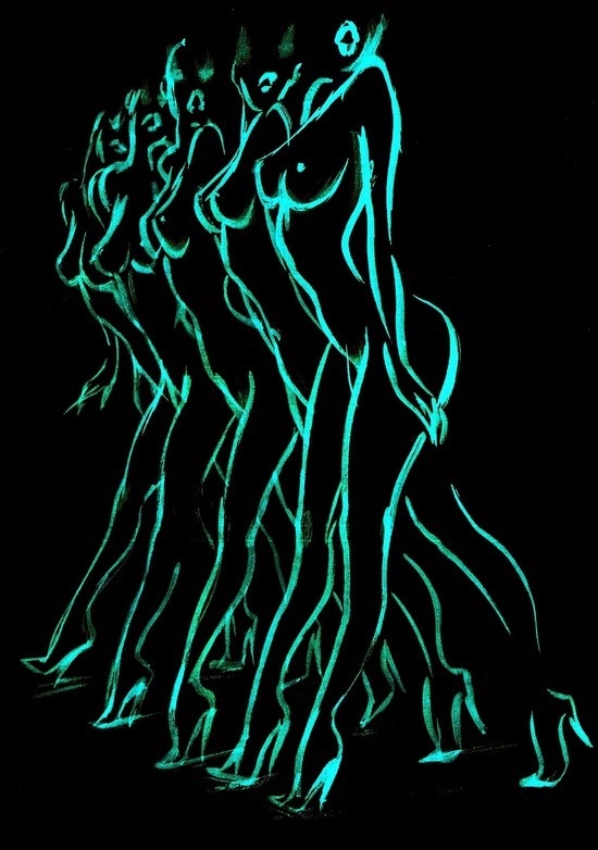
In this image I grabbed from tumblr, the sapphire blue stands out dominantly on the black background The nude women are in a position that is flashy and expressive, and I think the color chosen to outline them is successful symbolically.
Key the Color
 
The top picture I took is in Barcelona at the top of the W Hotel. The lighting of the ceiling gives off an orange hue that is reflected throughout the whole room. The bottom picture I took from tumblr, and red is dominant connecting the background and the subject's skin.
Contrasting Values
This is a character from the infamous Grand Theft Auto video game. I've always like the animation and art direction of the game series, despite the content. The subject here displays contrasting value in her whole figure, especially her skin. Her skin tone being the same color (hue), you can tell the light source is shining at her from the viewer's left through the contrast of value.

This is a design that stood out to me on the internet. With only the use of black and white, there are contrasting values within the use of line. The facade of the pyramid is brighter then the rest of it and the mountains, still black, contrast with the sky and foreground successfully.
|


No comments:
Post a Comment