Good and Bad Color Usage
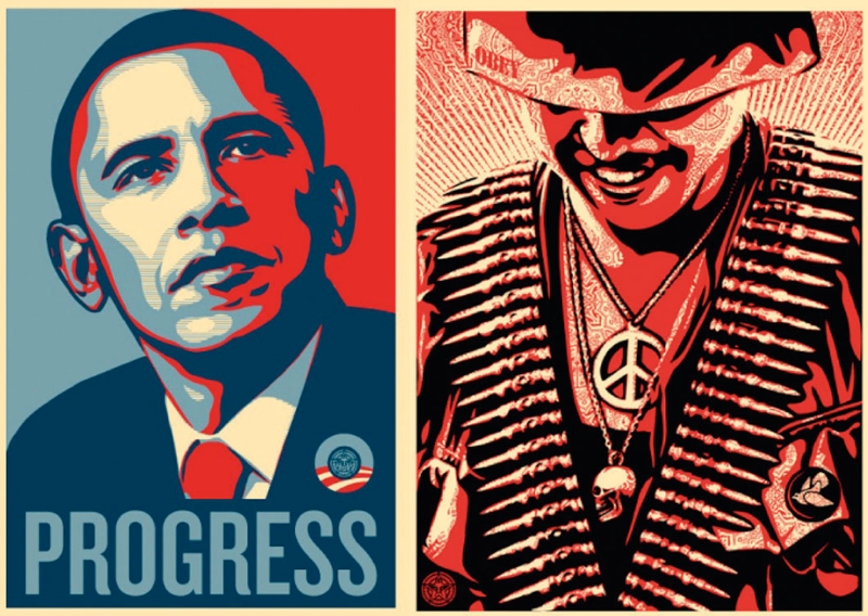
The left piece by Shepard Fairey’s for Obama’s
2008 campaign represents good color usage through symbolism of hope through
blue and red. The color connection can represent a number of things but the main thing that
people got out of it was the anticipation of change for America. In both of the works the artist uses a
limited pallet to achieve a powerful purpose and achieves his own style through
color unity.

This imitated version of Andy Warhol’s Cambell's Soup exhibits
bad color usage through the use of red and green not connecting successfully.
The yellow does not stand out and the background is not the best choice due to the blandness it gives off.
No comments:
Post a Comment